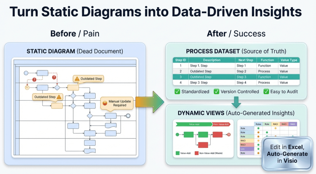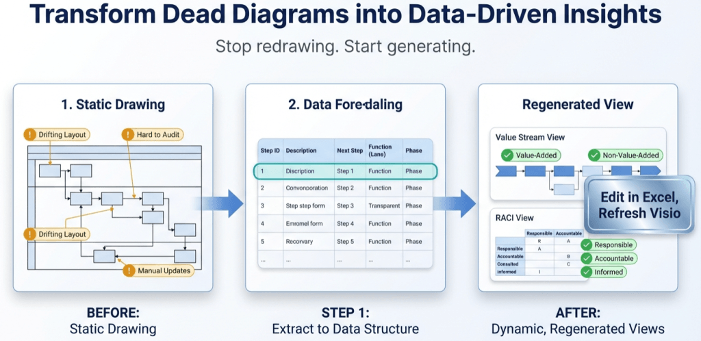
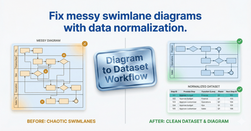
Swimlanes as Data: The Function Field That Makes or Breaks Cross-Functional Imports
If your cross-functional Data Visualizer diagram looks scrambled, the culprit is usually Function. Here’s the lane naming method that prevents chaos and keeps diagrams refreshable.
Yoast Focus Keyphrase: Data Visualizer Function field
Swimlanes as Data: The Function Field That Makes or Breaks Cross-Functional Imports Read More »