Swimlane Diagram

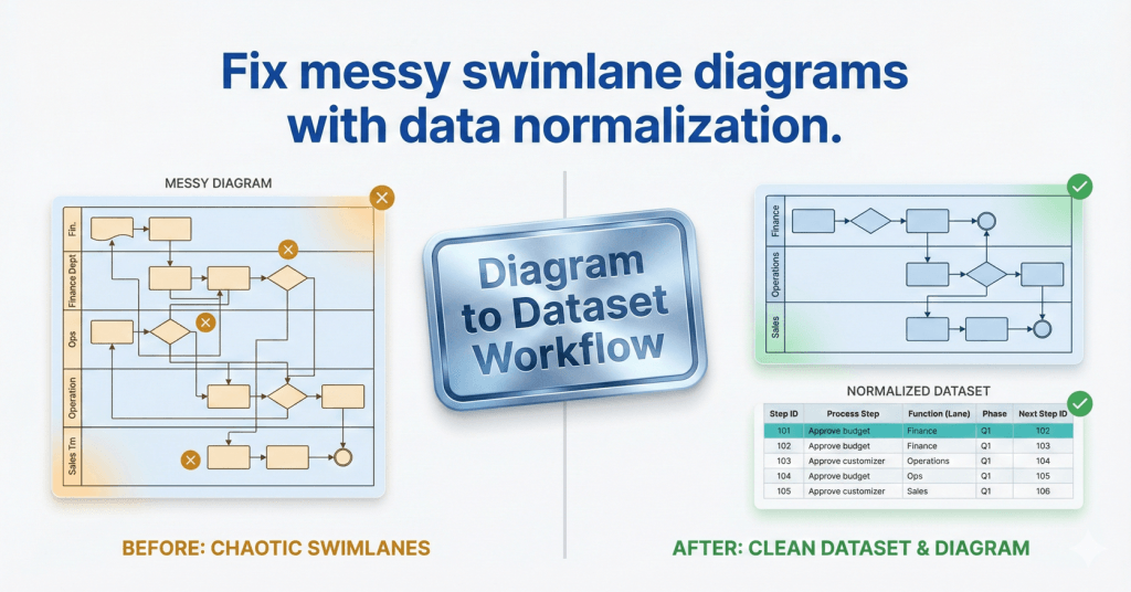
comparison graphic titled "Fix messy swimlane diagrams with data normalization." The left side shows a chaotic, unorganized cross-functional flowchart marked with amber warning signs, labeled "Before: Chaotic Swimlanes." The right side displays a clean, structured data table and a perfectly aligned flowchart marked with green success checks, labeled "After: Clean Dataset & Diagram." A central metallic badge reads "Diagram to Dataset Workflow.

Swimlanes as Data: The Function Field That Makes or Breaks Cross-Functional Imports

If your cross-functional Data Visualizer diagram looks scrambled, the culprit is usually Function. Here’s the lane naming method that prevents chaos and keeps diagrams refreshable.
Yoast Focus Keyphrase: Data Visualizer Function field

Swimlanes as Data: The Function Field That Makes or Breaks Cross-Functional Imports Read More »

, , , ,
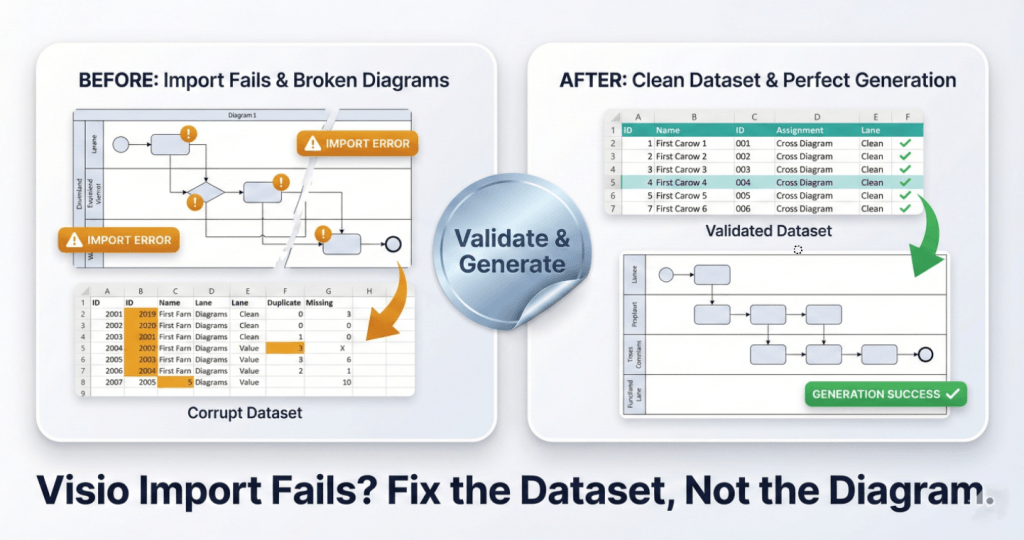
A square split-screen comparison graphic with a premium metallic trading-card finish. The bottom headline reads "Visio Import Fails? Fix the Dataset, Not the Diagram." The left card, labeled "BEFORE: Import Fails & Broken Diagrams," shows a "Corrupt Dataset" table with amber error highlights and a broken, glitchy flowchart diagram marked with "IMPORT ERROR" warning badges. A central shiny silver foil sticker reading "Validate & Generate" acts as a bridge to the right side. The right card, labeled "AFTER: Clean Dataset & Perfect Generation," displays a clean "Validated Dataset" table with green checkmarks and a perfectly generated, organized flowchart labeled "GENERATION SUCCESS."

Swimlanes as Data: The Function Field That Makes or Breaks Cross-Functional Imports

Most Data Visualizer import errors are not “Visio problems.” They’re dataset integrity problems. Here are 7 failure modes and the fastest way to isolate and fix them.
Yoast Focus Keyphrase: Visio Data Visualizer import error

Swimlanes as Data: The Function Field That Makes or Breaks Cross-Functional Imports Read More »
, , , ,
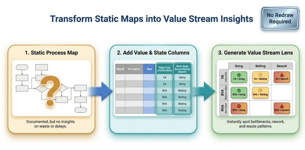
infographic titled ‘Transform Static Maps into Value Stream Insights.’ It shows a three-step flow from left to right: (1) a static process map with a question mark, labeled as documented but lacking insight; (2) a table adding value type (value-added, business value-added, non-value-added) and work state (doing, waiting, rework); and (3) a color-coded value stream lens matrix highlighting bottlenecks, waiting, rework, and waste. A badge in the top right reads ‘No Redraw Required

The Value Stream Lens: 1 process map, 9 insights (Pt. 2 of 3)

Once a process map exists as data, you can “re-lane” it without redrawing. This Lean value-stream lens replaces department swimlanes with VA/BVA/NVA and replaces phases with Doing/Waiting/Rework—creating a 3×3 grid of nine insights. It quickly surfaces bottlenecks, approval drag, and rework loops, and it’s easy to implement by adding two columns to your process table and regenerating the diagram.

The Value Stream Lens: 1 process map, 9 insights (Pt. 2 of 3) Read More »

, , , , , , , , , , ,
Scroll to Top